Fountain Pens In Use

Photo info: FUJIFILM X100T, 23mm, f/5, 1/2 sec, ISO200
“Smiling Pen” Cedar Park, 2020

Part of my work-from-home routine includes writing notes using my fountain pens, but I have pretty much narrowed down my in-use pen line up to three: Pilot Metropolitan (M) filled with Pilot Namiki Blue/Black ink, LAMY Safari (B) filled with Iroshizuku Ama-iro, and Pilot Kakuno (M) filled with Iroshizuku Chiku-rin. The black, blue, and green combination looks nice on the pages, and my notes are actually kind of fun to look back on! I tend to prefer thicker lines, so I retired my Pilot Metropolitan (F) and replaced it with the Kakuno medium-nib as my green ink pen. I really like the Kakuno because it’s all about fun – even the smiling face on the nib gives off a happy vibe! You can see it in the photo above. That’s my home notebook, and a short list of ukulele songs that I practice.

I hope you had a good day!

COVID-19 Data for Texas?

I’ve been checking the COVID-19 Dashboard for the county I live in daily, and I’ve noticed that there have been changes to the way the data is presented. Any of the more alarming charts showing unfavorable trends have been removed, and replaced with more favorable-looking charts. For instance, today’s chart shows an increasing number of tests given (that’s good), and also shows the percentage of positive cases as a result of the testing, which is somewhat flat at 7%. (screenshot below from 2020-05-22)

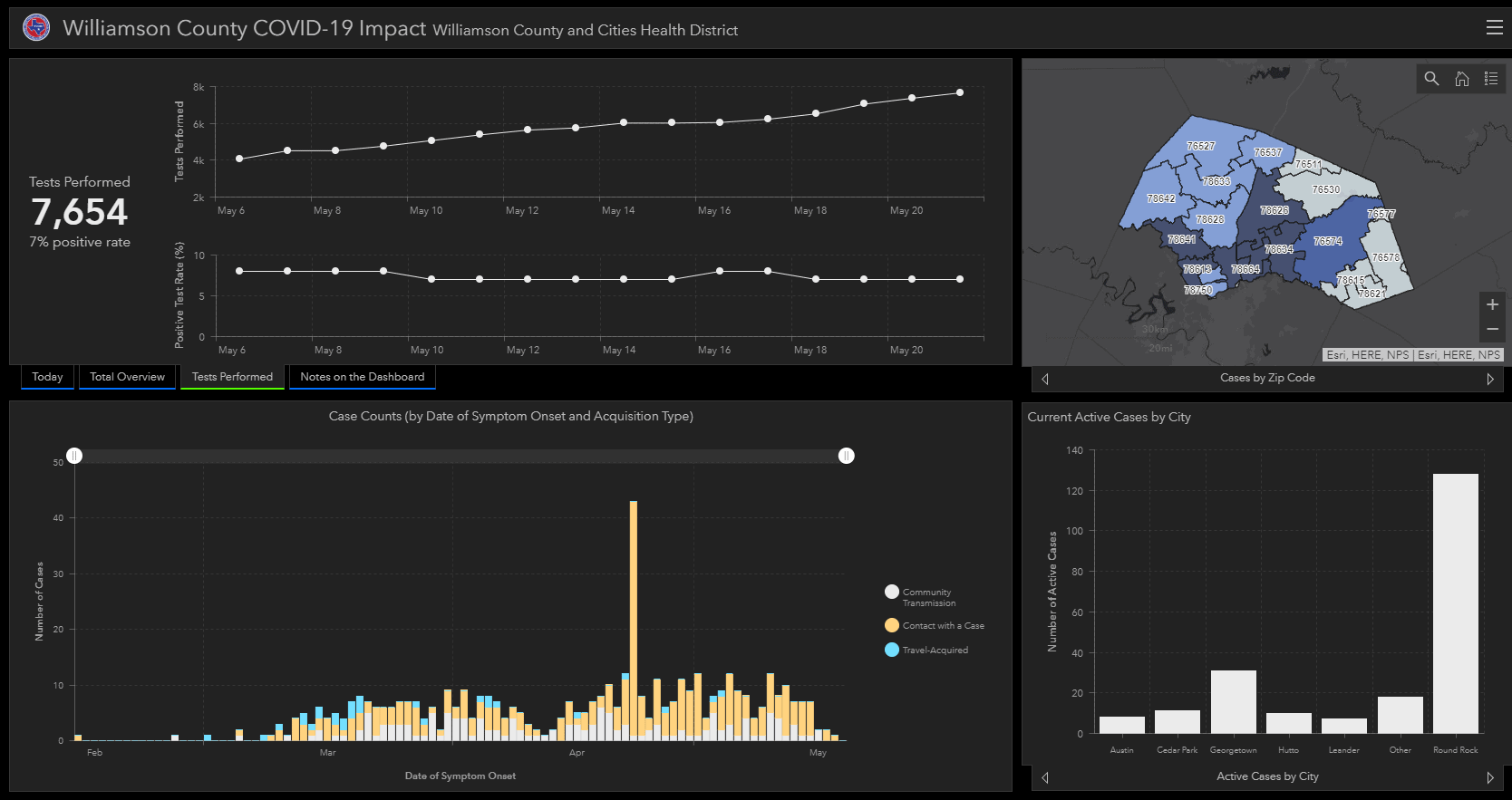
However, they don’t show a chart that combines that data, which would show an upward trend.

Just 10 days ago, “Cases Over Time” was one of the charts being shown (screenshot from 2020-05-12), but has since been removed:

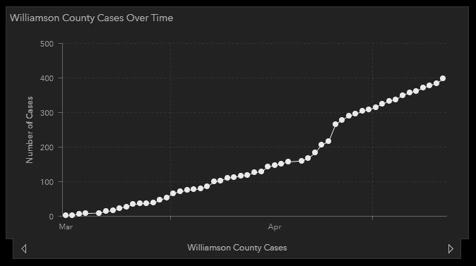
This chart, which shows no downward trend, is not supportive of the Texas government’s efforts to re-open the state. And my guess is that there was some kind of government communication to the owners of state dashboards to only show certain charts that support (or not damage) their cause. I don’t think this is an unreasonable suspicion given the fact that data suppression/manipulation was going on in Florida. I’m not saying the data for Texas is being manipulated, but the presentation of that data is – and in a way that supports the argument that Texas should open sooner rather than later.

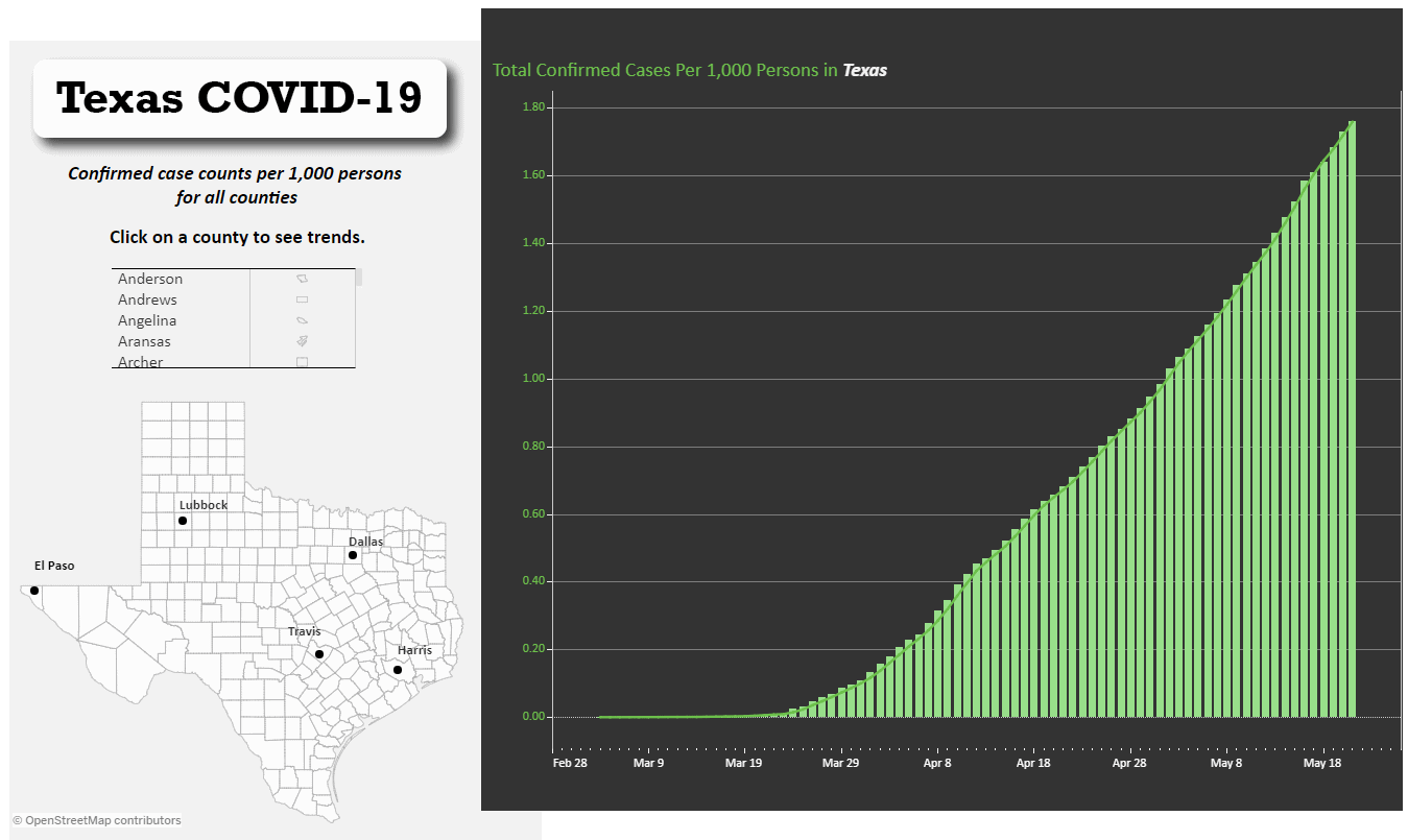
I’ve found another resource for data here, and with a little digging, you can find data presented in ways that you can pick and choose to support different viewpoints. For instance, here’s a screenshot of today’s trend (2020-05-22), which is not very encouraging:

We’re not out of the woods yet, folks. We might still be lost in the middle of the woods. 😟 Please keep practicing social distancing, wash your hands, and stay home if you can!

A Cure for Cold Mouse-Hand

Photo info: FUJIFILM X100T, 19mm, f/2.8, 1/50 sec, ISO3200
“Comfy Glove” Cedar Park, 2020

こんばんは。How’s it going?

Last year, I bought a pair of wool gloves for camping, after seeing them wear something similar in Yurukan, and have recently started using one while I am on my computer. My right wrist and hand tends to get cold on the desk when using the mouse, and for a while I was using a folded-up scarf as a makeshift wrist-rest and barrier between the cold desk and my wrist, but it always a bit in-the-way and would often slide off the desk and onto the floor.

Then I thought, “Why not use the glove?” Not only does it keep my hand warm, but it makes moving the mouse around a lot easier! And if my hand gets too warm, I can simply take it off and use it as a small wrist-rest that slides on the desk along with the mouse. It’s truly a game-changer for me.

I’m not sure why it took so long for me to figure this out, since I sometimes use a thin micro-fiber half-glove to use when drawing on a tablet or iPad. But I guess that is just for getting smoother lines when drawing, and not for warmth or comfort.

Anyways, if you also suffer from cold mouse-hand, maybe this will help. 😀

I hope you had a great day!

またね~